Challenge
The challenge was to brand Anton in such a way that the same logo and brand identity could be used across multiple channels and for multiple businesses like Anton Hospitals, Anton Pharmaceuticals, Anton Research Labs, Anton Retail stores, and more.

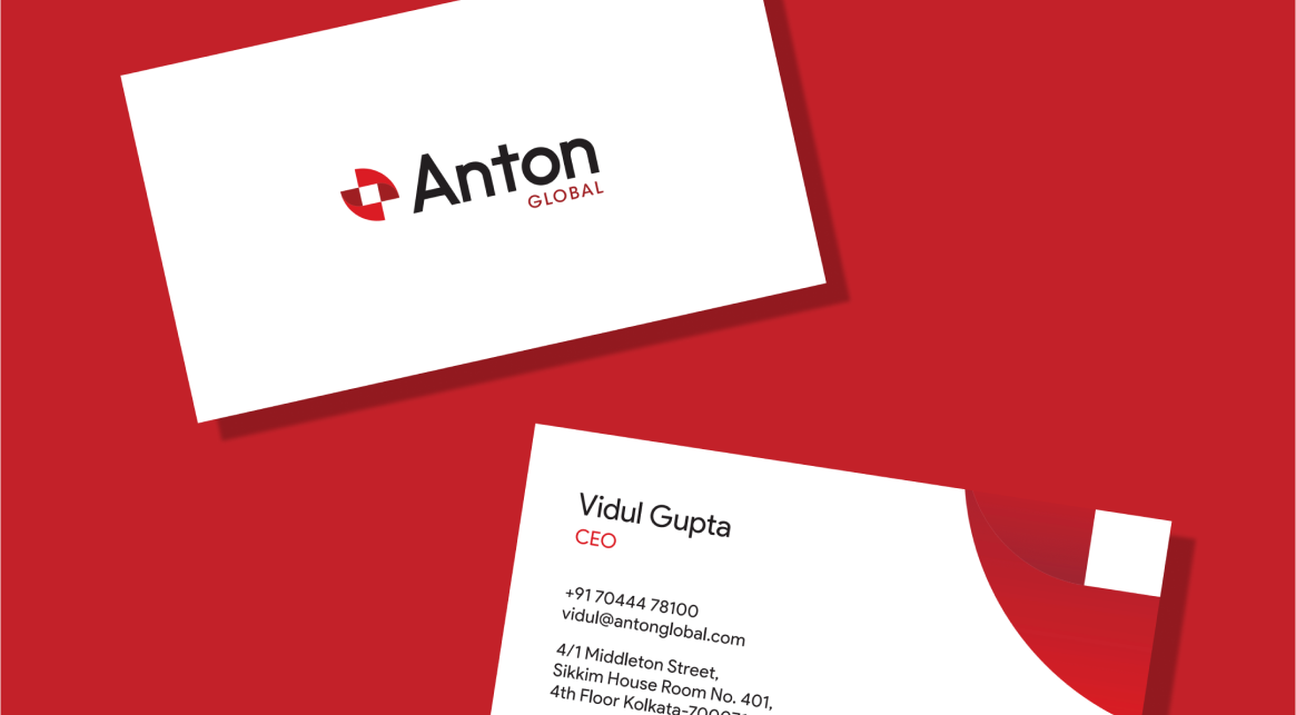
Logo Design
Anton’s logo had the responsibility of displaying the integrity and
reliability of the brand.
DNA is one of the most integral parts of the
human body. For the logo, the DNA symbol was merged with the medical sign + .
By following the ‘Golden Ratio’ while blending, a well crafted icon was
designed for Anton. The particular shade of red was used to make the logo
easily identifiable.
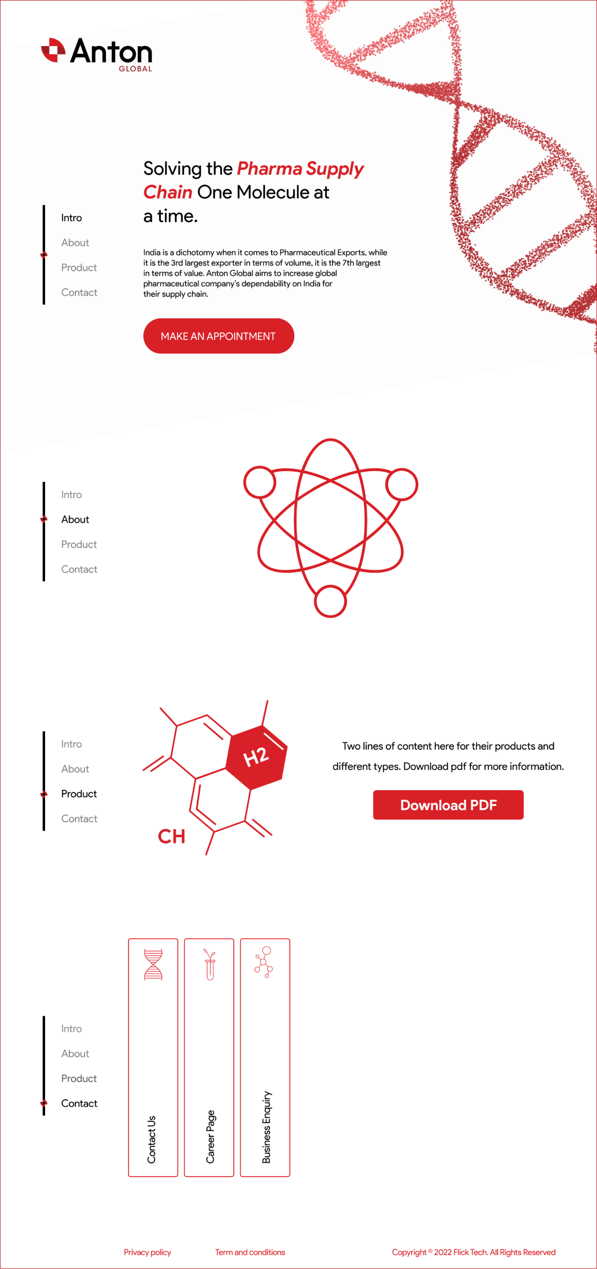
Brand Identity
We gave Anton branding that resonated with the healthcare industry.
A
combination of light red and dark red was used as the primary colours to
inculcate a sense of trust. Product Sans was selected as the primary font,
while ITC Avant Grade Gothic Std was the secondary font that portrayed energy
and enthusiasm. Icons in different coloured and monogram shapes were designed
that could be used on company brochures, websites, and other places. These
combined efforts gave the brand a very professional and business ready feel.