Challenge
The Altair is a part of a bigger real estate family of Real Spaces and therefore its design language had to be in sync with the parent company. However, it still needed to have its own unique identity that could set it apart from other projects.
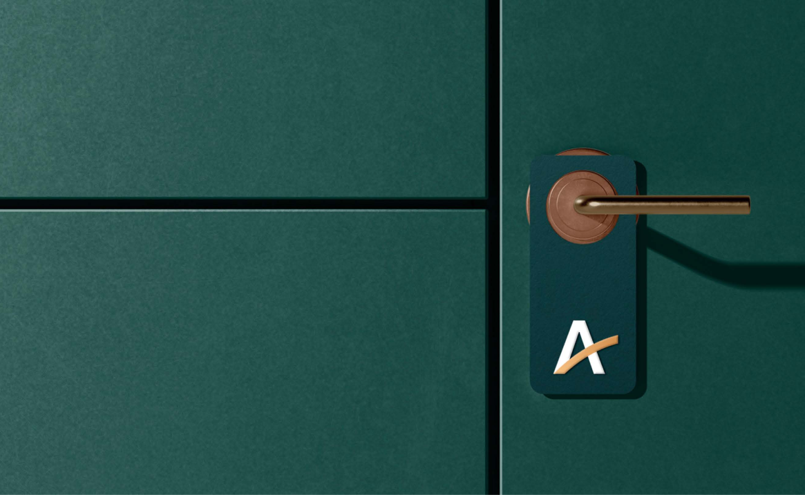
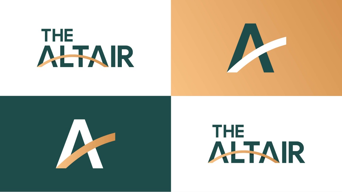
Branding and Logo Design
The thought process behind the creation of the logomark started from the brand
name itself. The Arc is used as a bridge of connection, and new beginnings,
new possibilities for the real estate market essential for people who seek
comfort and peace in a luxury lifestyle.
Two As represents the
Upward Arrows which emphasises the company's goal to move forward,
achieve new heights, and keep up with innovations. The structure was then
creatively combined to create a bold icon that is both minimal and useful as
the brand's logomark.
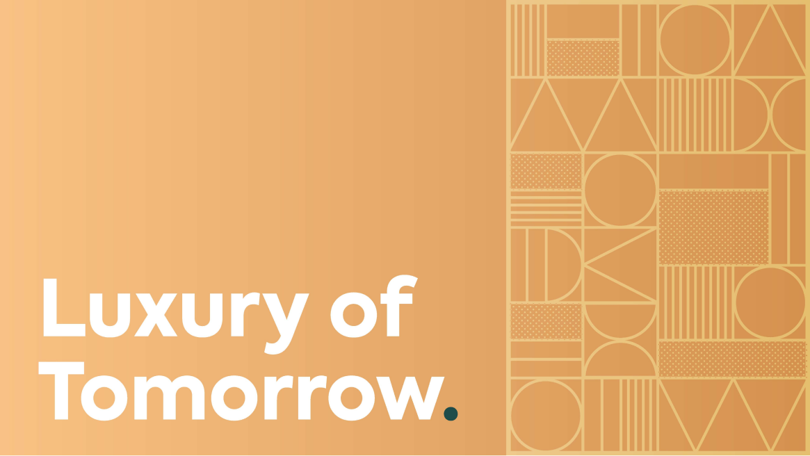
Brunswick Green used for the colour
palette represents ambition, wealth, calmness, and luxury. Where Fawn is a
light yellowish tan colour. It is usually used about clothing, soft
furnishings, and bedding.